A third post
Series: A Spoonful of Hugo
Grid is the very first CSS module created specifically to solve the layout problems we’ve all been hacking our way around for as long as we’ve been making websites.
Grid is the very first CSS module created specifically to solve the layout problems we’ve all been hacking our way around for as long as we’ve been making websites.
Grid is the very first CSS module created specifically to solve the layout problems we’ve all been hacking our way around for as long as we’ve been making websites.
Grid is the very first CSS module created specifically to solve the layout problems we’ve all been hacking our way around for as long as we’ve been making websites.
Genetic drift is the result of bernouli process on survival of individuals (given some probability for each of them) of a population over a number of independent trials (Generation).
Apparently there are two techniques of seeing such process – one individual level, other the population level. Both solutions are illustrated below. Let us suppose population of N individuals remains fixed from generation to generation, likewise, Fitness probability of “A” allele ($p(A)$) and “a” allele ($p(a)$) both starts off equal. Now we can generate incremental population survival probability for each individual for given population size:
In probability and statistics, the quantile function, associated with a probability distribution of a random variable, specifies the value of the random variable such that the probability of the variable being less than or equal to that value equals the given probability. It is also called the percent-point function or inverse cumulative distribution function.
For example, the cumulative distribution function of exponential ($\lambda$) (i.e. intensity \(\lambda\) and expected value (mean) \(\frac{1}{\lambda}\)) is:
The normal density function is:
$$ \large f(x) = \frac{1}{\sqrt{2 \pi} \sigma} \exp^{-\frac{(x - \mu)^2}{(2 \sigma^2)}} $$
It doesn’t make sense to calculate the probability for a single value in a continuous probability function, it is by definition zero, but you can calculate relative likelihoods (heights). dnorm simply gives the value of the function for a given x, not the area under the curve for that x (which is basically nothing for a single value). To find the density (height) for a single x value on the normal distribution, use dnorm() in the following way (here each x value is treated as separate and vectorized over),
Linear mixed models are widely used in Agriculture and Plant Breeding, as of recent. With access to genotype data high resolution phenotype data, it has become more of a requirement to use this family of model.
Mixed models allow for experimental (design or outcome) variables’ parameter estimates to have probabilistic distributions – most commonly normal – with opportunity to specify different variance-covariance components among the levels of those variables. In this post, I wish to discuss on some of the popular mixed modeling tools and techniques in the R community with links and discussion of the concepts surrounding variations of modeling techniques.
This fn joins two matrices alternately columnwise, which is why this is the source of inspiration for generating serpentine design.
alternate.cols <- function(m1, m2) {
  cbind(m1, m2)[, order(c(seq(ncol(m1)), seq(ncol(m2))))]
}
A custom function to create a serpentine design in whatever fashion specified:
serpentine <- function(x, columnwise=TRUE){
  if (columnwise) {
    odd <- x[, seq(1, by=2, length.out = ncol(x)/2)] # odd x
    rev_even <- x[, seq(from = 2,
                        by=2,
                        length.out = (ifelse((ncol(x)%%2 != 0),
                                             ((ncol(x)/2)-1),
                                             (ncol(x)/2))))][seq(dim(x)[1],1),] # or, even[rev(1:nrow(x)),] # reversed even x
    alternate_cbind <-  cbind(odd, rev_even)[, order(c(seq(ncol(odd)),
                                                       seq(ncol(rev_even))))]
    return(alternate_cbind)}
  else {
    odd <- x[seq(1, by=2, length.out = nrow(x)/2),] # odd x
    rev_even <- x[seq(from = 2, by=2, length.out = (ifelse((nrow(x)%%2 != 0),
                                                           ((nrow(x)/2)-1),
                                                           (nrow(x)/2)))), ][, seq(dim(x)[2],1)] # or, even[, rev(1:ncol(x))] # reversed even x
    alternate_rbind <-  rbind(odd, rev_even)[order(c(seq(nrow(odd)),
                                                     seq(nrow(rev_even)))), ]
    return(alternate_rbind)
  }
}
Let’s see the function in action
Correlation is a bivariate summary statistic. It basically talks of direction and magnitidue of association of two variables. Besides formatting with significance stars, color coding correlation coefficient table might be helpful to pick patterns out in a quick glimpse.
Table 1 presents correlation matrix of yield and yield component traits (a blue \(\rightarrow\) red color profile represents increasing magnitude of positive correlation between traits). Following code is helpful if somebody provides a correlation table with stars in it and tells you to prettify it. Note that lower or upper halves only cannot be used to determine the discrete color values so full column is required.
A cluster analysis is a classification problem. It is dealt in several ways, one of which is hierarchial agglomeration. The method allows for easy presentation of high dimensional data, more of so when the number of observations is readily fitted into a visualization.
Here’s I deal with a case of clustering typically seen in agriculture and field research where a researcher tests typically a large number of genotypes and seeks to see them organized into distinguishable clusters using dendrogram. Data concerns observations on disease incidence in rice genotypes of various stages – germinating seed to maturity nearing crop. Following provides a descriptive summary of the observation variables.
# # paste together dataframe columns by column index
# take the following df

df <- data.frame(my_number = letters[1:5],
                 column_odd1 = rnorm(5),
                 column_even1 = rnorm(5),
                 column_odd2 = rnorm(5),
                 column_even2 = rnorm(5),
                 column_odd3 = rnorm(5),
                 column_even3 = rnorm(5))

df %>%
  select(1) %>%
  bind_cols(data.frame(setNames(lapply(list(c(2,3), c(4, 5), c(6, 7)), function(i)
    do.call(sprintf, c(fmt = "%0.3f (%0.3f)", # round at third place after decimal. use %s if columns were character type
                       df[i]))), c("new_column1", "new_column2", "new_column3"))))
##   my_number     new_column1     new_column2     new_column3
## 1         a -0.682 (-1.828) -1.304 (-0.113)  1.121 (-0.586)
## 2         b -1.178 (-0.809)   0.534 (0.524) -1.330 (-0.709)
## 3         c -0.432 (-2.787) -1.586 (-0.105)  1.449 (-0.533)
## 4         d  -1.258 (0.455) -0.071 (-0.786) -0.326 (-0.607)
## 5         e   0.329 (0.525)   0.011 (1.141)  0.043 (-0.228)
Let’s say we have two variable – survey response of farmer to willingness to adopt improved rice variety (in YES/NO) and them having been trained earlier about agricultural input management (in trained/untrained).
Read in the data and notice the summary.
rice_data <- readxl::read_xlsx(here::here("content", "blog", "data", "rice_variety_adoption.xlsx")) %>%
  mutate_if(.predicate = is.character, as.factor)

rice_variety_adoption <- readxl::read_xlsx(here::here("content", "blog", "data", "rice_variety_adoption.xlsx")) %>%
  select(improved_variety_adoption, training) %>%
  # convert data to suitable factor type for analysis.
  mutate_if(is.character, as.factor)

head(rice_variety_adoption) # now we have data
## # A tibble: 6 × 2
##   improved_variety_adoption training
##   <fct>                     <fct>
## 1 No                        No
## 2 Yes                       No
## 3 No                        No
## 4 Yes                       No
## 5 Yes                       No
## 6 No                        No
As a basic descriptive, contruct one way and two way cross tabulation summary, showing count of each categories. This is because logistic regression uses count data, much like in a non-parametric model.
Probit models were the first of those being used to analyze non-normal data using non-linear models. In an early example of probit regression, Bliss(1934) describes an experiment in which nicotine is applied to aphids and the proportion killed is recorded. As an appendix to a paper Bliss wrote a year later (Bliss, 1935), Fisher (1935) outlines the use of maximum likelihood to obtain estimates of the probit model.
## # A tibble: 5,555 × 6
##    beta_id  time       S      I      R beta_value
##    <chr>   <dbl>   <dbl>  <dbl>  <dbl>      <dbl>
##  1 1         0   0.7     0.02   0.01          3.2
##  2 1         0.5 0.662   0.0541 0.0134        3.2
##  3 1         1   0.575   0.133  0.0223        3.2
##  4 1         1.5 0.420   0.268  0.0420        3.2
##  5 1         2   0.242   0.411  0.0763        3.2
##  6 1         2.5 0.117   0.491  0.122         3.2
##  7 1         3   0.0521  0.506  0.172         3.2
##  8 1         3.5 0.0235  0.484  0.222         3.2
##  9 1         4   0.0111  0.450  0.269         3.2
## 10 1         4.5 0.00559 0.413  0.312         3.2
## # ℹ 5,545 more rows
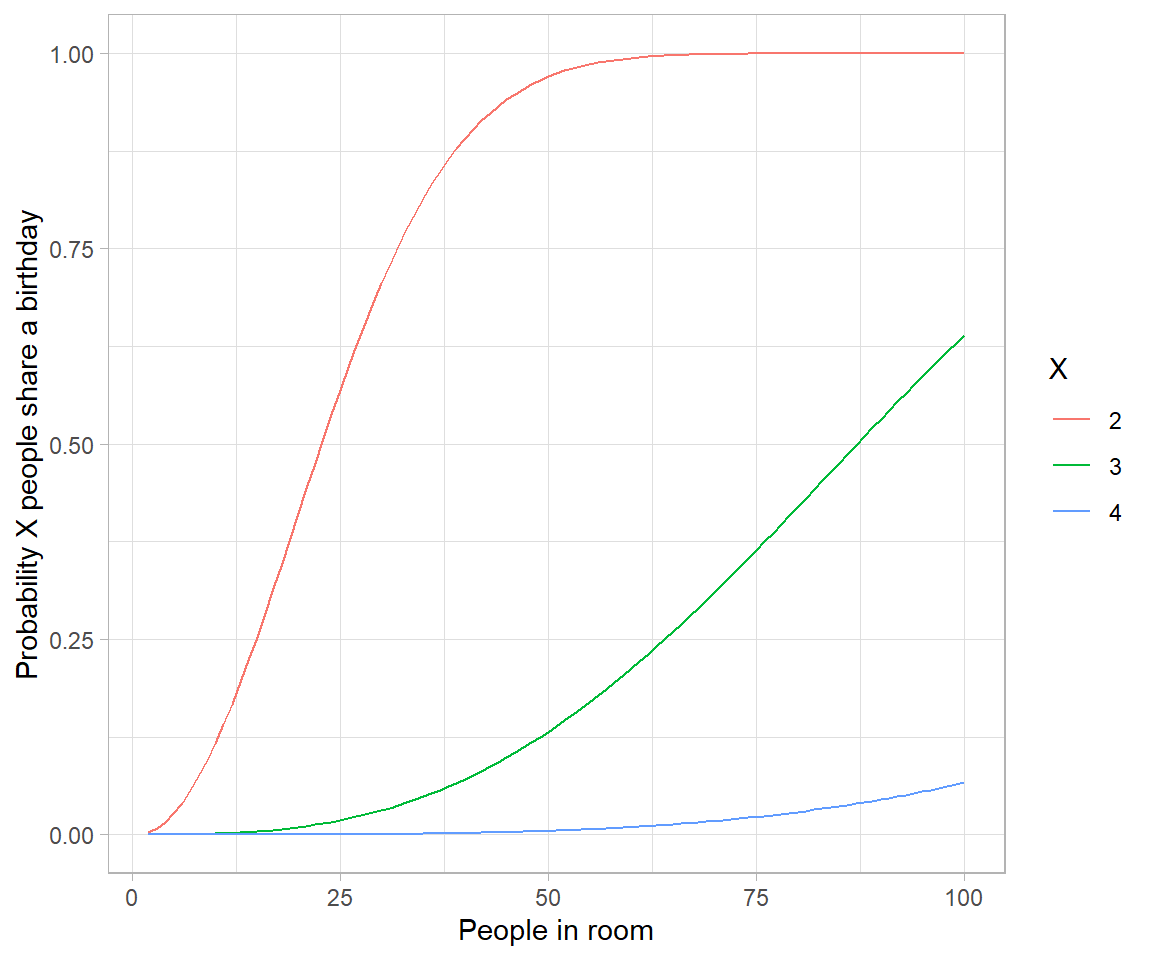
# Birthday problem

crossing(n = 2:100,
         x = 2:4) %>%
  mutate(probability = map2_dbl(n, x, ~pbirthday(.x, coincident = .y))) %>%
  ggplot(aes(n, probability, color = factor(x))) +
  geom_line() +
  labs(x = "People in room",
       y = "Probability X people share a birthday",
       color = "X")
# Approximating birthday paradox with Poisson distribution

crossing(n = 2:250,
         x = 2:4) %>%
  mutate(combinations = choose(n, x),
         probability_each = (1/365)^(x-1),
         poisson = 1-dpois(0, combinations * probability_each),
         pbirthday_x = map2_dbl(n, x, ~pbirthday(.x, coincident = .y))) %>%
  gather(type, probability, pbirthday_x, poisson) %>%
  ggplot(aes(n, probability, color = factor(x), lty = type)) +
  geom_line() +
  labs(x = "People in room",
       y = "Probability X people share a birthday",
       color = "X",
       lty = "")
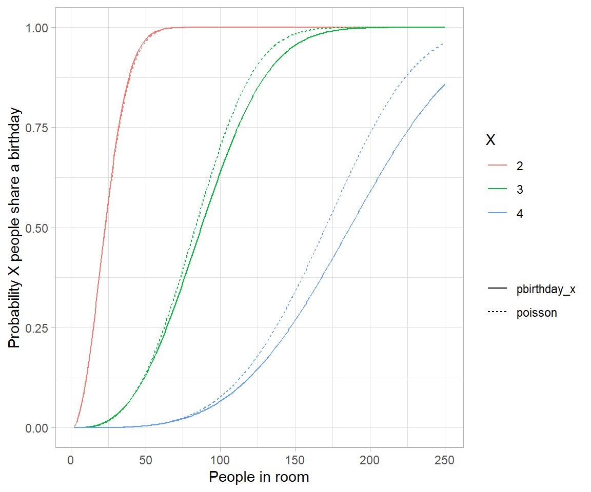
# the reason is because events are no longer weakly dependent-every pair makes triplets
# more likely.

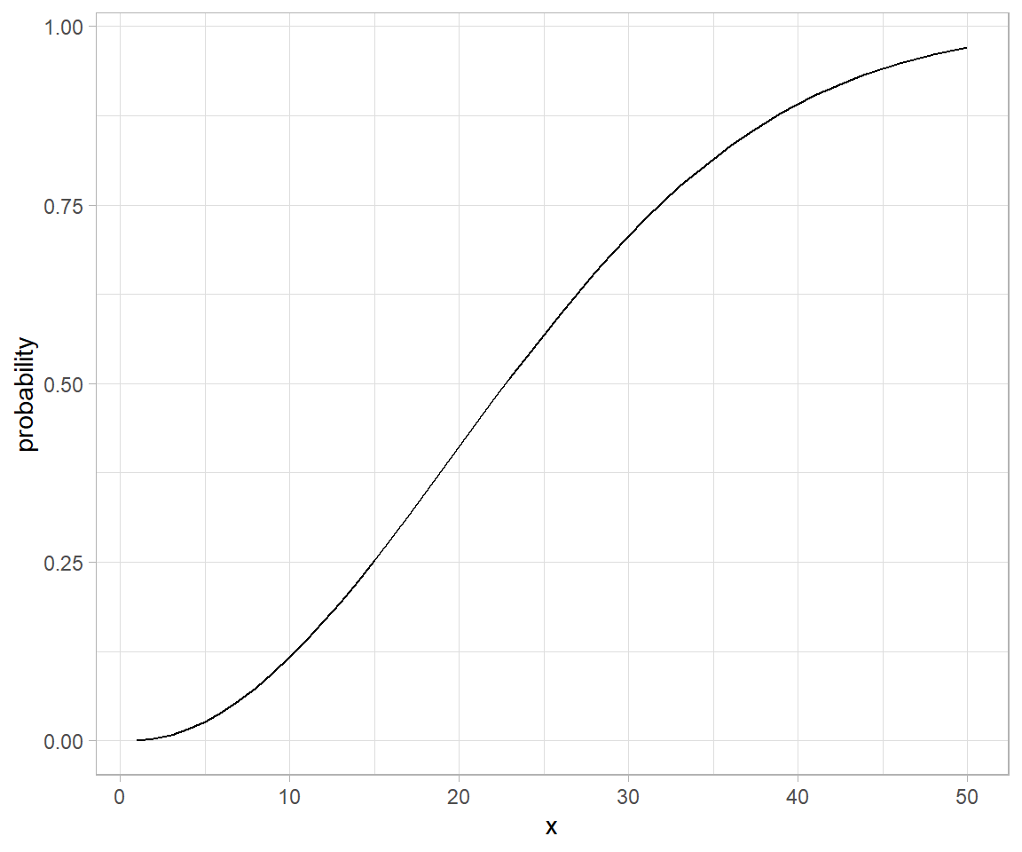
# Analytical solution to birthday problem (Mikhail Papov; bearlogic.github.io)

# Suppose, we are interested in the probability that, in a set of n randomly chosen people, some pair of them will have the same
# birthday (which we refer to as event A).

# Using Kolmogorov axionms and conditional probability, we can derive an analytical solution for P(A):

# P(A) = 1-\frac{n!.\binom{365}{n}}{365^n}

# This can be solved in `R` as:

pa <- function(n){
  1 - (factorial(n) * choose(365, n))/(365^n)
}

map_dfr(.x = list(probability = 1:50), .f = pa) %>%
  mutate(x = seq_along(probability)) %>%
  ggplot(aes(x = x, y = probability)) +
  geom_line()
Wikipedia defines a piecewise linear function as:
“a function defined on a (possibly unbounded) interval of real numbers, such that there is a collection of intervals on each of which the function is an affine function”
# piecewise linear functions using if statements

# piecewise linear function defined using if for cases.
pw.function <- function(t) {
  if(t < 0.5) {
    0.7 * t/0.5
  } else {
    0.7 + 0.3*(t-0.5)/0.5
  }
}

pw.function <- Vectorize(pw.function)

tibble(t = seq(0.05:0.99, by = 0.05)) %>%
  mutate(pfun_out = pw.function(t)) %>%
  ggplot() +
  geom_line(aes(x = t, y = pfun_out), group = "combined_grp")
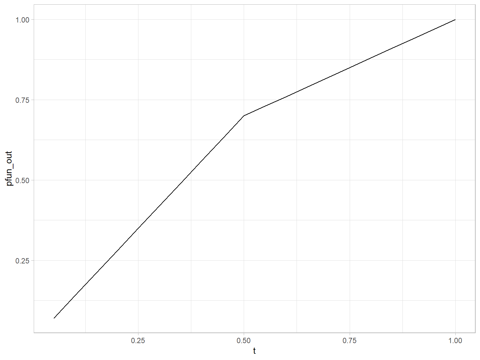
In segmentation and curve fitting. For a larger discourse refer to segmented package in cran.
The anatomy of flag is well described in tipsntricks/readresort section but the quirks of constructing it are not. I will be updating attending to complete the graphics as soon as I learn more.
So far, only this ugly shape is what I have here to show;
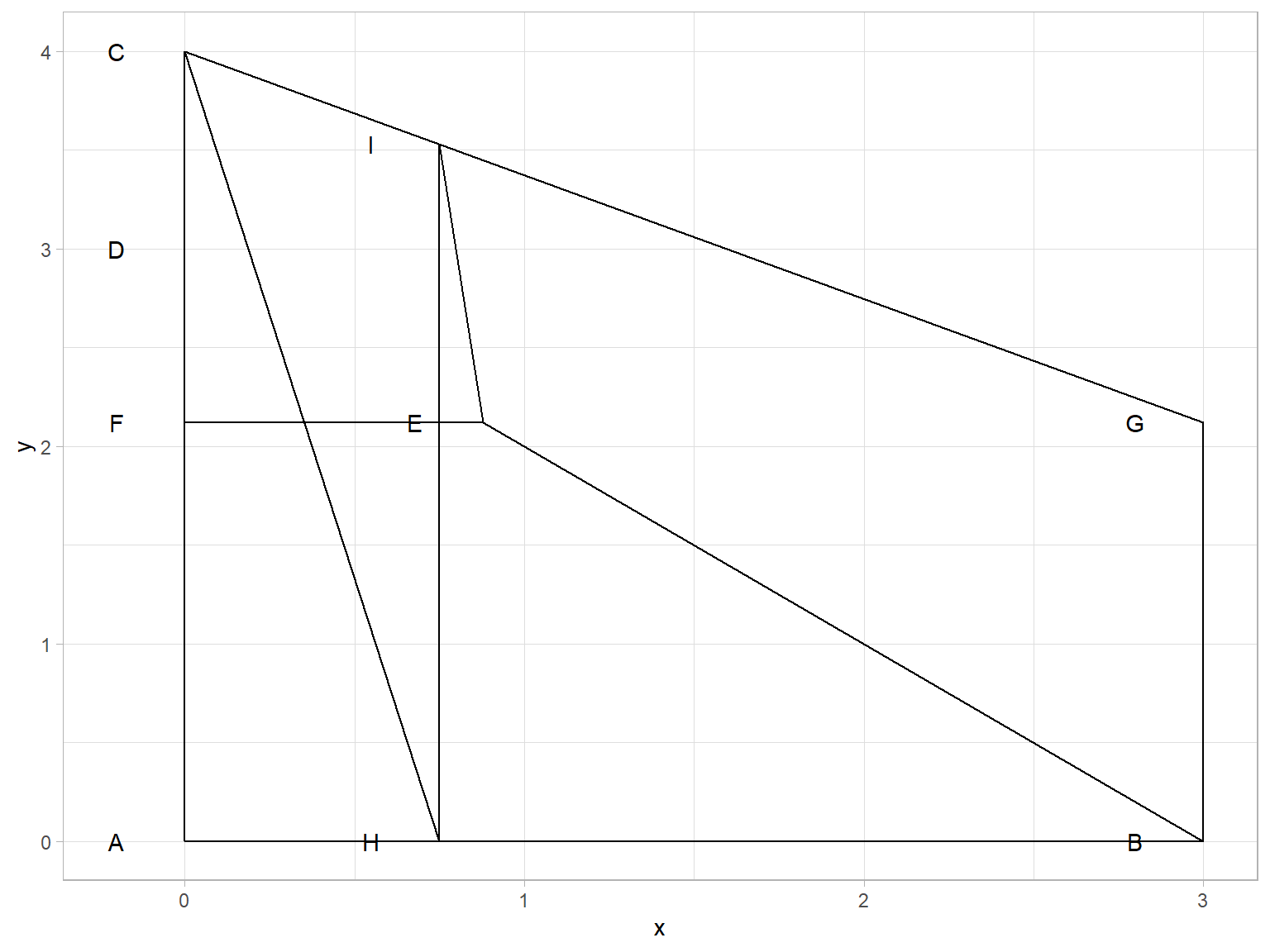
Table: Table 1: Data summary
| Name | Piped data |
| Number of rows | 308 |
| Number of columns | 9 |
| _______________________ | |
| Column type frequency: | |
| character | 8 |
| numeric | 1 |
| ________________________ | |
| Group variables | None |
Variable type: character
Table output of R is one of the richest and satisfying to use feature. Rmarkdown format provides loads of package support to create, format, and present tables beautifully. This is on one aspect extremely useful while on the other end it could very well be daunting as to choose between various package options to use while formating your table. I have a bunch of suggestions and enlistments here to help get off that dilemma.
Although not a new topic in finance and portfolio management, as some of the tweets below suggest, it’s application in field of Agricultural Economics and commodity market analysis is not often highlighted. A tweet relating S2F and bitcoin (BTC) trading was posted recently.
In this post, I demonstrate what are the basic ingredients of the cointegration analysis. In particular, I provide some context as to how it came to being and what it’s roots are in theory. While catching along the core applications, I will use example dataset and present its features, in synology.
Incidentally, I ran into outer product function outer today. It is extremely powerful function, in that it computes all combinations of product of two objects. One simplest and obvious demonstration is the multiplication table of numbers. 😄
We can show multiplication table of numbers 1 through 12 each multiplied 1 through 10.
outer(1:10, 1:12, "*")
##       [,1] [,2] [,3] [,4] [,5] [,6] [,7] [,8] [,9] [,10] [,11] [,12]
##  [1,]    1    2    3    4    5    6    7    8    9    10    11    12
##  [2,]    2    4    6    8   10   12   14   16   18    20    22    24
##  [3,]    3    6    9   12   15   18   21   24   27    30    33    36
##  [4,]    4    8   12   16   20   24   28   32   36    40    44    48
##  [5,]    5   10   15   20   25   30   35   40   45    50    55    60
##  [6,]    6   12   18   24   30   36   42   48   54    60    66    72
##  [7,]    7   14   21   28   35   42   49   56   63    70    77    84
##  [8,]    8   16   24   32   40   48   56   64   72    80    88    96
##  [9,]    9   18   27   36   45   54   63   72   81    90    99   108
## [10,]   10   20   30   40   50   60   70   80   90   100   110   120
Another immediate use can be seen in design and combinatorics. For instance,
Building this static site generator theme was the first time I used an Atomic (or Functional) CSS system like Tachyons. It’s a design system that provides very small (which means fast) CSS modules that you can use in your HTML.
Grid is the very first CSS module created specifically to solve the layout problems we’ve all been hacking our way around for as long as we’ve been making websites.
This theme has a form-to-email feature built in, thanks to the simple Formspree integration. All you need to activate the form is a valid recipient email address saved in the form front matter.
Correlation study is one of the most extensively yet not fully appreciated topic. It forms the backbone of several other inferential studies. Path analysis, on a similar note, is a derived technique that explains directed dependencies among a set of variables. It is almost exactly a century old now and still finds uses in several fields of causal inference.
In oder to understand the process of causal inference (thought to be successor of path analysis), it is important to understand the basics about categories of variables. Below I have pointed out some of the concepts.
Suppose you have a bunch of really filthy names, which makes you puke… You can go about fixing those with the help of stringi and stringr
Lets say following character vector hosts those filthy names.
filthy <- c("Grains %", "Moisture (gm/kg)", "Plant height (cm)", "White   spaces", "White space  (filth%)")
filthy
## [1] "Grains %"              "Moisture (gm/kg)"      "Plant height (cm)"
## [4] "White   spaces"        "White space  (filth%)"
Now to get rid of the filth use string manipulation.
This post is all about examples and use cases. So…Let’s break a leg.
nasty_char <- c("I love playing wildly") # remove the last word "wildly"

stringr::str_extract(nasty_char, ".*(?=\\s[:alpha:]*$)")
## [1] "I love playing"
Variance component models are also suited for analysis of incomplete block designs, besides complete block designs. This post aims to demonstrate exactly that. Using a dataset generated from alpha lattice design, I show how the design can be properly modeled and fit using OLS regression having various fixed model components. This system of model fitting is analogous to classical ANOVA based technique of estimating parameters.
Mixed models are quite tricky, in that, while being very powerful extensions of linear models, they are somewhat difficult to conceptualize and otherwise to specify. Mixed models have, in addition to usual fixed effect combination of factors, random effects structure. These structure need to be specified in the model formula in R. While formula specification of a model is unique in it’s own respect, the formuala expression too leads to an object with differnt properties than a regular R object. Although, the complexity of formula syntax can arbitrary (constrained by classess and methods working on that), a general guideline is applicable for most of the mixed modeling utilities. These include: lme4, nlme, glmmADMB and glmmTMB.
In a field experiment to test for effects of fungicide on crop, treatment of fungicides may be distinguised into multiple factors – based on chemical constituent, based on formulation, based on the mode of spray, etc. In a general case scenario where two former factors could be controlled, factor combinations may be organized in several different ways. When fully crossed implementation is not possible, split plot design comes to the rescue.
This approach highlights features of gridExtra package that allows combining multiple grob plots using function calls.
We explicitly use lapply/split or similar class of purrr functions to really scale the graphics.
We load a Hybrid maize trial dataset, with fieldbook generated using agricolae::design.rcbd(). The dataset looks as shown in Table 1, after type conversion and cleaning.
| Rep | Block | Plot | Entry | col | row | tillering | moisture1 | moisture2 | Ear count | Plant height |
|---|---|---|---|---|---|---|---|---|---|---|
| 1 | 1 | 1 | 1 | 1 | 1 | 3.0 | 3.5 | 35 | 270 | |
| 1 | 1 | 2 | 3 | 1 | 2 | 3.0 | 3.5 | 25 | 266 | |
| 1 | 1 | 3 | 18 | 1 | 3 | 3.5 | 4.0 | 30 | 261 | |
| 1 | 1 | 4 | 32 | 1 | 4 | 4.0 | 4.5 | 26 | 224 | |
| 1 | 1 | 5 | 37 | 1 | 5 | 4.0 | 4.5 | 30 | 268 | |
| 1 | 2 | 6 | 27 | 1 | 6 | 4.0 | 4.5 | 20 | 268 | |
| 1 | 2 | 7 | 21 | 1 | 7 | 4.0 | 4.5 | 25 | 277 | |
| 1 | 2 | 8 | 13 | 1 | 8 | 3.5 | 4.0 | 25 | 264 |
For the given dataset, we can draw on the information that Rep variable was used as field level blocking factor (Although separate, Block, variable exists, it was nested inside the Rep.) Therefore, to begin with, we ignore other spatial grouping variable. Now, since the grid graphics only requires two way represenation of plotting data, we have row and col information feeding for that.
Unlike composing a text memos and keeping tracks of those, calendar graphics is a highly effective visual aid to taking notes and summarizing them. Well, we all have used calendar, one way or the other, in our lifetimes.
Calendar based graphics enables an accurate catch at the very first glance; For example, it is very easy relating one activity of a period to another when they are laid linearly with precise graduations. Calendar graphics does exactly that – some features (usually tiles) provide graduation, representing fixed interval of time (e.g., a day). This when combined with text allows unlimited freedom to provide narration for specific intervals.
Flow diagrams are jam-packed with information. They normally describe a process and actors that are involved in making that happen.
With r package diagram, which uses r’s basic plotting capabilities, constructing flowcharts is as easy as drawing any other graphics.
This post expands on creating simple flowdiagrams using example scenario of a wheat breeding program. The information for this graph was, most notably, deduced from those provided by senior wheat breeder of Nepal, Mr. Madan Raj Bhatta.
| roll number | English Total Marks | Nepali Total Marks | C. Maths Total Marks | Science Total Marks | Extension Total Marks | Soil Total Marks | Plant protection Total Marks | Fruit Total Marks | Agronomy Total Marks | Computer Total Marks | O. Maths Total Marks | English Total Marks Agg grade | Nepali Total Marks Agg grade | C. Maths Total Marks Agg grade | Science Total Marks Agg grade | Extension Total Marks Agg grade | Soil Total Marks Agg grade | Plant protection Total Marks Agg grade | Fruit Total Marks Agg grade | Agronomy Total Marks Agg grade | Computer Total Marks Agg grade | O. Maths Total Marks Agg grade |
|---|---|---|---|---|---|---|---|---|---|---|---|---|---|---|---|---|---|---|---|---|---|---|
| 1 | 70.2 | 57.2 | NA | 72.4 | 77.3 | 84.9 | 81.9 | 74.8 | 88.2 | 88.3 | NA | B+ | C+ | NA | B+ | B+ | A | A | B+ | A | A | NA |
| 2 | 76.8 | 46.2 | NA | 63.2 | 72.1 | 82 | 77 | 71.7 | 81.2 | 74.7 | NA | B+ | C | NA | B | B+ | A | B+ | B+ | A | B+ | NA |
| 3 | 82.8 | 57 | NA | 56 | 89.8 | 82.5 | 82.1 | 85.3 | 89.7 | 79 | NA | A | C+ | NA | C+ | A | A | A | A | A | B+ | NA |
| 4 | 42.4 | 19.5 | NA | 20.6 | 48.8 | 58.2 | 50.1 | 49.8 | 54.8 | 67 | NA | C | E | NA | D | C | C+ | C+ | C | C+ | B | NA |
| 5 | 55.2 | 34.3 | NA | 33.2 | 49.6 | 64.2 | 59.8 | 57.1 | 61 | 73.3 | NA | C+ | D | NA | D | C | B | C+ | C+ | B | B+ | NA |
| 6 | 49.5 | 43.3 | NA | 24.8 | 51.7 | 55.5 | 52.9 | 46.4 | 55.4 | 65.5 | NA | C | C | NA | D | C+ | C+ | C+ | C | C+ | B | NA |
| 7 | 71.4 | 50.4 | NA | 54.8 | 75.7 | 71.6 | 76.8 | 61.7 | 80.6 | 77.2 | NA | B+ | C+ | NA | C+ | B+ | B+ | B+ | B | A | B+ | NA |
| 8 | 73.8 | 45.3 | NA | 62 | 83.9 | 81.7 | 78.1 | 83.6 | 88.2 | 79.4 | NA | B+ | C | NA | B | A | A | B+ | A | A | B+ | NA |
| 9 | 51.9 | 39.9 | NA | 26.8 | 56.9 | 56 | 62 | 49.6 | 57.2 | 64.7 | NA | C+ | D | NA | D | C+ | C+ | B | C | C+ | B | NA |
| 10 | NA | NA | NA | NA | NA | NA | NA | NA | NA | NA | NA | NA | NA | NA | NA | NA | NA | NA | NA | NA | NA | NA |
| 11 | 42 | 20.6 | NA | 22.1 | 49.2 | 54.2 | 53.8 | 44.5 | 51.2 | 59.3 | NA | C | D | NA | D | C | C+ | C+ | C | C+ | C+ | NA |
| 12 | 52.6 | 22 | NA | 36.9 | 57.9 | 69.6 | 67.1 | 61.2 | 65.8 | 68.2 | NA | C+ | D | NA | D | C+ | B | B | B | B | B | NA |
| 13 | 61.8 | 30.8 | NA | 27.9 | 59.5 | 65.8 | 63.3 | 53.8 | 62.4 | 70.7 | NA | B | D | NA | D | C+ | B | B | C+ | B | B+ | NA |
| 14 | 58.8 | 32.6 | NA | 19 | 51.8 | 54.7 | 63.3 | 48.4 | 60.1 | 68 | NA | C+ | D | NA | E | C+ | C+ | B | C | B | B | NA |
| 15 | 69.3 | 34.6 | NA | 35.1 | 55.3 | 62.3 | 63.5 | 63.8 | 66.2 | 80.6 | NA | B | D | NA | D | C+ | B | B | B | B | A | NA |
| 16 | 54.9 | 23.9 | NA | 29 | 48.7 | 56.6 | 54.4 | 53.4 | 55.7 | 59.6 | NA | C+ | D | NA | D | C | C+ | C+ | C+ | C+ | C+ | NA |
| 17 | 58.2 | 37.2 | NA | 25.7 | 66.9 | 66.6 | 66.3 | 62.8 | 70.1 | 64.4 | NA | C+ | D | NA | D | B | B | B | B | B+ | B | NA |
| 18 | NA | NA | NA | NA | NA | NA | NA | NA | NA | NA | NA | NA | NA | NA | NA | NA | NA | NA | NA | NA | NA | NA |
| 19 | 48.7 | 40.9 | NA | 27.4 | 77.1 | 72.8 | 70 | 66.5 | 75.2 | 62.6 | NA | C | C | NA | D | B+ | B+ | B+ | B | B+ | B | NA |
| 20 | 48.1 | 26.5 | NA | 22.9 | 56.7 | 64.6 | 54 | 51.2 | 64.6 | 61.9 | NA | C | D | NA | D | C+ | B | C+ | C+ | B | B | NA |
| 21 | NA | NA | NA | NA | NA | NA | NA | NA | NA | NA | NA | NA | NA | NA | NA | NA | NA | NA | NA | NA | NA | NA |
| 22 | 70.5 | 42.8 | NA | 55 | 70.5 | 74.4 | 60.8 | 73.2 | 81.5 | 73.2 | NA | B+ | C | NA | C+ | B+ | B+ | B | B+ | A | B+ | NA |
| 23 | NA | NA | NA | NA | NA | NA | NA | NA | NA | NA | NA | NA | NA | NA | NA | NA | NA | NA | NA | NA | NA | NA |
| 24 | 32.5 | 31.2 | NA | 18.7 | 46.2 | 47.4 | 49.2 | 48.5 | 46.7 | 55.4 | NA | D | D | NA | E | C | C | C | C | C | C+ | NA |
| 25 | 46.7 | 43.3 | NA | 29.6 | 55.2 | 59.9 | 59.7 | 55.5 | 60.3 | 61.7 | NA | C | C | NA | D | C+ | C+ | C+ | C+ | B | B | NA |
| 26 | 58.5 | 51.6 | NA | 36.6 | 75.3 | 70.6 | 75.8 | 67.4 | 80.4 | 68.3 | NA | C+ | C+ | NA | D | B+ | B+ | B+ | B | A | B | NA |
| 27 | NA | NA | NA | NA | NA | NA | NA | NA | NA | NA | NA | NA | NA | NA | NA | NA | NA | NA | NA | NA | NA | NA |
| 28 | 66.3 | 45.9 | NA | 58.6 | 77.9 | 80.8 | 79 | 63 | 79.1 | 81.1 | NA | B | C | NA | C+ | B+ | A | B+ | B | B+ | A | NA |
| 29 | 43.8 | 42.2 | NA | 30.7 | 55.9 | 64.4 | 57.5 | 51.9 | 56.1 | 64.1 | NA | C | C | NA | D | C+ | B | C+ | C+ | C+ | B | NA |
| 30 | 55.2 | 41.2 | NA | 29 | 55.8 | 68 | 61.8 | 57.6 | 65.5 | 64.3 | NA | C+ | C | NA | D | C+ | B | B | C+ | B | B | NA |
| 31 | 67.8 | 51.8 | NA | 51.8 | 80.3 | 74.9 | 79.3 | 73.4 | 82.6 | 72.1 | NA | B | C+ | NA | C+ | A | B+ | B+ | B+ | A | B+ | NA |
| 32 | 61.8 | 41.4 | NA | 52.4 | 71.9 | 76.4 | 76 | 74.7 | 77 | 66.3 | NA | B | C | NA | C+ | B+ | B+ | B+ | B+ | B+ | B | NA |
| 33 | 54.9 | 45.1 | NA | 30.5 | 65.2 | 78.9 | 76.8 | 64.2 | 78.1 | 72.8 | NA | C+ | C | NA | D | B | B+ | B+ | B | B+ | B+ | NA |
| 34 | 52 | 37.6 | NA | 25.9 | 51.4 | 60.2 | 60.6 | 55.5 | 60.5 | 61.8 | NA | C+ | D | NA | D | C+ | B | B | C+ | B | B | NA |
| 35 | NA | NA | NA | NA | NA | NA | NA | NA | NA | NA | NA | NA | NA | NA | NA | NA | NA | NA | NA | NA | NA | NA |
| 36 | 54.6 | 40.9 | NA | 32.3 | 51.8 | 62.6 | 58.9 | 58.5 | 55.2 | 65.7 | NA | C+ | C | NA | D | C+ | B | C+ | C+ | C+ | B | NA |
| 37 | 18.9 | 14.7 | NA | 17.4 | 5.7 | 24 | 18 | 18 | 10.1 | 25.7 | NA | E | E | NA | E | E | D | E | E | E | D | NA |
| 38 | 61.5 | 42.7 | NA | 59.4 | 80.8 | 83.2 | 72.8 | 74.4 | 84 | 70.8 | NA | B | C | NA | C+ | A | A | B+ | B+ | A | B+ | NA |
| 39 | 74.4 | 40.2 | NA | 49.8 | 62.1 | 60.9 | 60.9 | 59.1 | 66.6 | 77.1 | NA | B+ | C | NA | C | B | B | B | C+ | B | B+ | NA |
NA indicates the absence of student
R code is a tree
Every expression in R can be broken down to a form represented by a tree. For instance, on top of the tree there is “a function call” followed by it’s branches: first child = function name itself, other children = function arguments. Complex calls have multiple levels of branching.
The code tree could be captured by quoting
expr() quotes your(function developer) expression
Time and again, I’ve suffered due to my humanistic limitations of memorizing things promptly. I suck at remembering stuffs, dates particularly. So, In this blog trip (Oh! this is a trip btw, because I don’t forsee myself surpassing my memory limitations any sooner than death), I will be stating if not rambing on some lifesaving tricks of picking up pieces of your faulty brain.
I’m getting into the details of using base R’s date() and date related functions. At this time, It’s might seem relevent to have some understanding of “POSIXlt” and “POSIXct” object classes. But most often these never interfere unless you have a good – not expecting perfect – conscience of how you recorded your dates and what you eventually intent to achieve from it. Anyway, for a quick reference, here I’ve quoted the R’s documentation on ?DateTimeClasses:
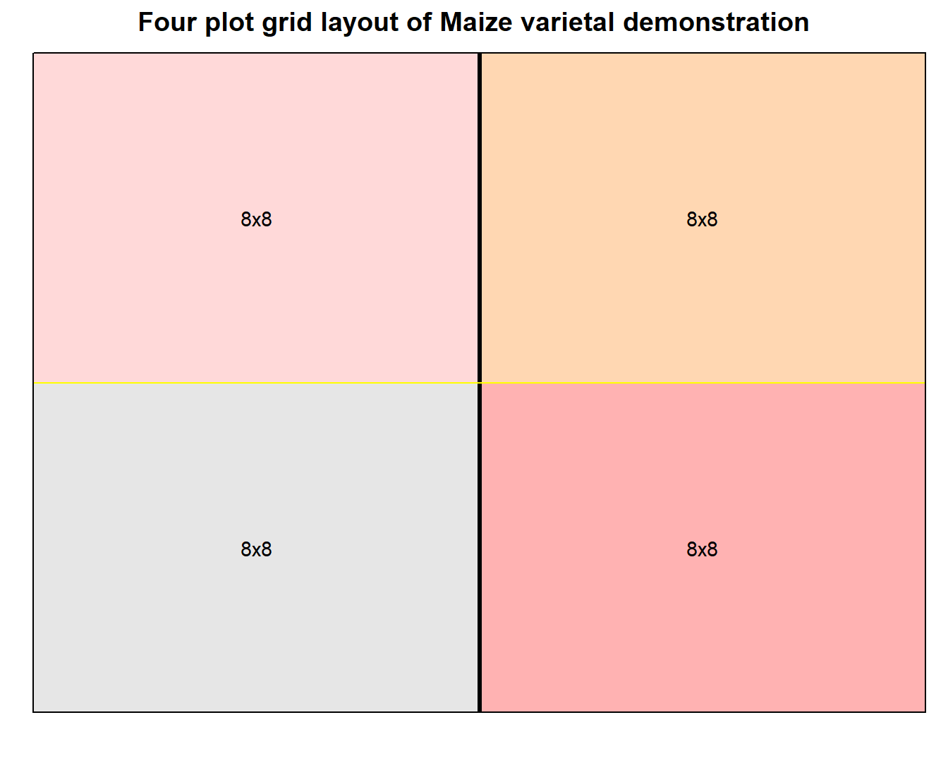
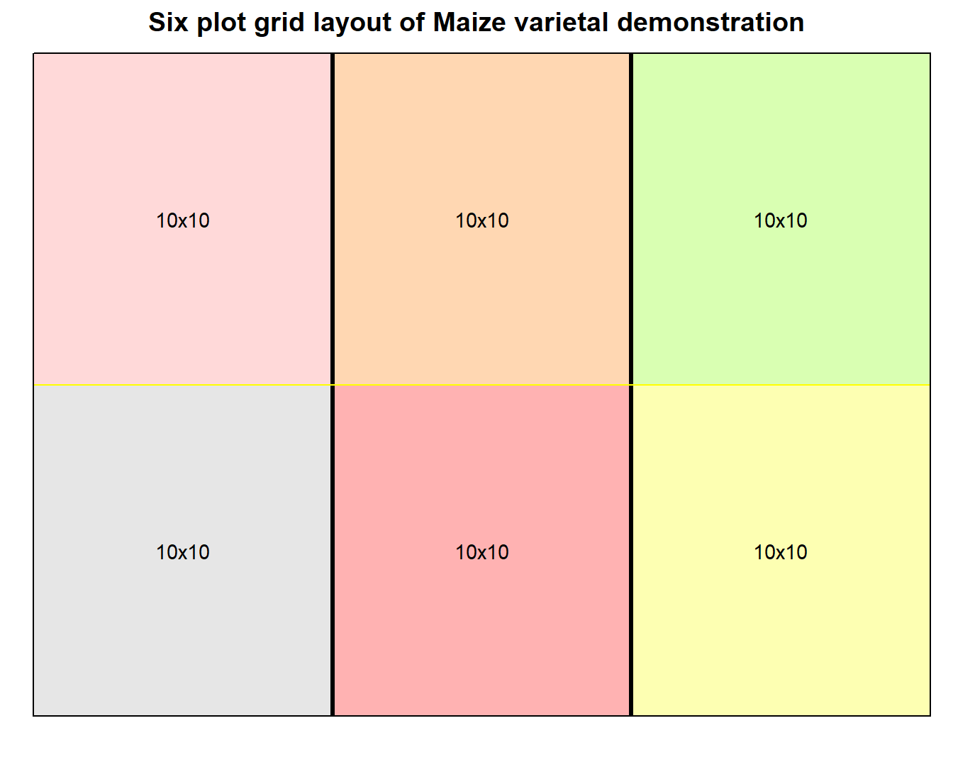
Figure 1: Grid layout design of varietal demonstration for small number of plots
Comparison of treatments may also imply cross comparison of their stability across multiple environments, especially when a study constitutes a series of trials that are each conducted at different locations and/or at different periods in time (henceforth referred to as MET; Multi-Environment Trial). Several situations exist where only mean based performance analysis are regarded inconclusive.
For example, in varietal release process the authorizing body seeks record of consistent trait performace of certain crop genotype. The imperative is: a variety needs to be stably exhibit it’s characters in the proposed domain of cultivation, which generally is a wide area, throughout a long duration of cultivation cycles. This pre-condition of stable character inheritance is more relevant to crops constituting a homogenous and homozygous population. Either of the location, time period or combination of both, more commonly framed as year in field researches, could be assumed to present an unique environment that treatment entries are tested in. Thus, for results to be widely applicable, performance measures across environments should be more or less stable. To the contrary, the concept of utilizing differential character expression across different environments is often explored when interaction between genotypes and environments result in more desirable character.
Everybody has their own secret mantra which they find useful and will eventually apply for their unique set of problems. As a rummaging wanna-be R programmer, almost daily I shovel through rich contents of web in lookout for gurus. It’s a bit puzzling to know that most of them come faceless, nevertheless amazing are the quality of the contents the offer.
Either of the creating, editing or deploying a website has never been easy, to me especially. In fact, It’s just been a few weeks, not more than a month that I deployed my first website. I can’t thank enough the blogdown project by Yihui Xie that, at the first place, inspired me to make this personalized website of my own, showing how seemlessly can the technicalities be overcome. Before this I haven’t for once attempted to write an html code for a website as such.
factor is an headache
I have a dataset, cleaning which has been a pain lately. I’m going to use 20 observations of the imported dataset in this post to demonstrate how pathetically have I been advancing with it.
| plot | jan_23_2017 | jan_26_2017 | jan_29_2017 | feb_02_2017 |
|---|---|---|---|---|
| 1 | 0 | 0 | b | am |
| 2 | f | s | 1p | 10p |
| 3 | b | a | sm | 3p |
| 4 | b | b | ap | 2 |
| 5 | 0 | b | bp | s |
| 6 | b | a | sp | 3 |
Providing it a context, the columns represent multiple observations of same variable at different dates, as apparent from the column names.