R

Simulating genetic drift

Genetic drift is the result of bernouli process on survival of individuals (given some probability for each of them) of a population over a number of independent trials (Generation).

Apparently there are two techniques of seeing such process – one individual level, other the population level. Both solutions are illustrated below. Let us suppose population of N individuals remains fixed from generation to generation, likewise, Fitness probability of “A” allele ($p(A)$) and “a” allele ($p(a)$) both starts off equal. Now we can generate incremental population survival probability for each individual for given population size:
Missing negative from the normal

A normal function isn’t so normal

The normal density function is:

$$ \large f(x) = \frac{1}{\sqrt{2 \pi} \sigma} \exp^{-\frac{(x - \mu)^2}{(2 \sigma^2)}} $$

It doesn’t make sense to calculate the probability for a single value in a continuous probability function, it is by definition zero, but you can calculate relative likelihoods (heights). dnorm simply gives the value of the function for a given x, not the area under the curve for that x (which is basically nothing for a single value). To find the density (height) for a single x value on the normal distribution, use dnorm() in the following way (here each x value is treated as separate and vectorized over),

Internals of Mixed Models

Linear mixed models are widely used in Agriculture and Plant Breeding, as of recent. With access to genotype data high resolution phenotype data, it has become more of a requirement to use this family of model.

Mixed models allow for experimental (design or outcome) variables’ parameter estimates to have probabilistic distributions – most commonly normal – with opportunity to specify different variance-covariance components among the levels of those variables. In this post, I wish to discuss on some of the popular mixed modeling tools and techniques in the R community with links and discussion of the concepts surrounding variations of modeling techniques.

Serpentine design and sorting

Take a grid and serpentine it row-wise or column-wise

This fn joins two matrices alternately columnwise, which is why this is the source of inspiration for generating serpentine design.

alternate.cols <- function(m1, m2) {
  cbind(m1, m2)[, order(c(seq(ncol(m1)), seq(ncol(m2))))]
}

A custom function to create a serpentine design in whatever fashion specified:

serpentine <- function(x, columnwise=TRUE){
  if (columnwise) {
    odd <- x[, seq(1, by=2, length.out = ncol(x)/2)] # odd x
    rev_even <- x[, seq(from = 2, 
                        by=2, 
                        length.out = (ifelse((ncol(x)%%2 != 0), 
                                             ((ncol(x)/2)-1), 
                                             (ncol(x)/2))))][seq(dim(x)[1],1),] # or, even[rev(1:nrow(x)),] # reversed even x
    alternate_cbind <-  cbind(odd, rev_even)[, order(c(seq(ncol(odd)), 
                                                       seq(ncol(rev_even))))]
    return(alternate_cbind)}
  else {
    odd <- x[seq(1, by=2, length.out = nrow(x)/2),] # odd x
    rev_even <- x[seq(from = 2, by=2, length.out = (ifelse((nrow(x)%%2 != 0), 
                                                           ((nrow(x)/2)-1), 
                                                           (nrow(x)/2)))), ][, seq(dim(x)[2],1)] # or, even[, rev(1:ncol(x))] # reversed even x
    alternate_rbind <-  rbind(odd, rev_even)[order(c(seq(nrow(odd)), 
                                                     seq(nrow(rev_even)))), ]
    return(alternate_rbind)
  }
}

Let’s see the function in action

Color formatting of correlation table

Correlation

Correlation is a bivariate summary statistic. It basically talks of direction and magnitidue of association of two variables. Besides formatting with significance stars, color coding correlation coefficient table might be helpful to pick patterns out in a quick glimpse.

Table 1 presents correlation matrix of yield and yield component traits (a blue \(\rightarrow\) red color profile represents increasing magnitude of positive correlation between traits). Following code is helpful if somebody provides a correlation table with stars in it and tells you to prettify it. Note that lower or upper halves only cannot be used to determine the discrete color values so full column is required.

Paste together multiple columns

# # paste together dataframe columns by column index
# take the following df

df <- data.frame(my_number = letters[1:5], 
                 column_odd1 = rnorm(5), 
                 column_even1 = rnorm(5), 
                 column_odd2 = rnorm(5), 
                 column_even2 = rnorm(5), 
                 column_odd3 = rnorm(5), 
                 column_even3 = rnorm(5))

df %>% 
  select(1) %>% 
  bind_cols(data.frame(setNames(lapply(list(c(2,3), c(4, 5), c(6, 7)), function(i) 
    do.call(sprintf, c(fmt = "%0.3f (%0.3f)", # round at third place after decimal. use %s if columns were character type
                       df[i]))), c("new_column1", "new_column2", "new_column3"))))
##   my_number     new_column1     new_column2     new_column3
## 1         a -0.682 (-1.828) -1.304 (-0.113)  1.121 (-0.586)
## 2         b -1.178 (-0.809)   0.534 (0.524) -1.330 (-0.709)
## 3         c -0.432 (-2.787) -1.586 (-0.105)  1.449 (-0.533)
## 4         d  -1.258 (0.455) -0.071 (-0.786) -0.326 (-0.607)
## 5         e   0.329 (0.525)   0.011 (1.141)  0.043 (-0.228)

Logistic Regression: Part II - Varietal adoption dataset

Binary classifier using categorical predictor

Let’s say we have two variable – survey response of farmer to willingness to adopt improved rice variety (in YES/NO) and them having been trained earlier about agricultural input management (in trained/untrained).

Read in the data and notice the summary.

rice_data <- readxl::read_xlsx(here::here("content", "blog", "data", "rice_variety_adoption.xlsx")) %>% 
  mutate_if(.predicate = is.character, as.factor)

rice_variety_adoption <- readxl::read_xlsx(here::here("content", "blog", "data", "rice_variety_adoption.xlsx")) %>%
  select(improved_variety_adoption, training) %>% 
  # convert data to suitable factor type for analysis.
  mutate_if(is.character, as.factor)

head(rice_variety_adoption) # now we have data
## # A tibble: 6 × 2
##   improved_variety_adoption training
##   <fct>                     <fct>   
## 1 No                        No      
## 2 Yes                       No      
## 3 No                        No      
## 4 Yes                       No      
## 5 Yes                       No      
## 6 No                        No

As a basic descriptive, contruct one way and two way cross tabulation summary, showing count of each categories. This is because logistic regression uses count data, much like in a non-parametric model.

Logistic Regression: Part I - Fundamentals

Likelihood theory

Probit models were the first of those being used to analyze non-normal data using non-linear models. In an early example of probit regression, Bliss(1934) describes an experiment in which nicotine is applied to aphids and the proportion killed is recorded. As an appendix to a paper Bliss wrote a year later (Bliss, 1935), Fisher (1935) outlines the use of maximum likelihood to obtain estimates of the probit model.

Linear model fitting for regression: Basics and Variation

Linear model (simple forms) fitting

I use mtcars dataset to construct some basic regression models and fit those.

# convert available data to use in fitting
mtcars_reg_df <- mtcars %>% 
  rownames_to_column("carnames") %>% 
  as_tibble() %>% 
  mutate_at(c("gear", "am", "vs", "cyl"), as.factor)

We will be comparing difference between cylinder means for mpg.

# # intercept only lm tidiying and visualization
mpg_model1 <- mtcars_reg_df %>%
  group_by(cyl) %>%
  nest() %>%
  group_by(cyl) %>%
  mutate(mpg_model = map(data, ~lm(`mpg` ~ 1, .x))) %>%
  mutate(
    # rsqrd = map_dbl(mpg_model, ~summary(.x)[['r.squared']]), # this is '0' of intercept only model
    intercept_pvalue = map_dbl(mpg_model, ~summary(.x)[['coefficients']][1, 4]),
    intercept_se = map_dbl(mpg_model, ~summary(.x)[['coefficients']][1, 2]),
    intercept_coef = map_dbl(mpg_model, ~summary(.x)[['coefficients']][1, 1])
  ) %>%
  select(cyl, mpg_model, contains("intercept"), data)

Intercept-only models (each group fitted a different one) are plotted to reflect variation in estimated parameters. Two methods can be used to obtain same result. In the first, standard error obtained from model summary can be directly used; in the other SE can be manually computed.

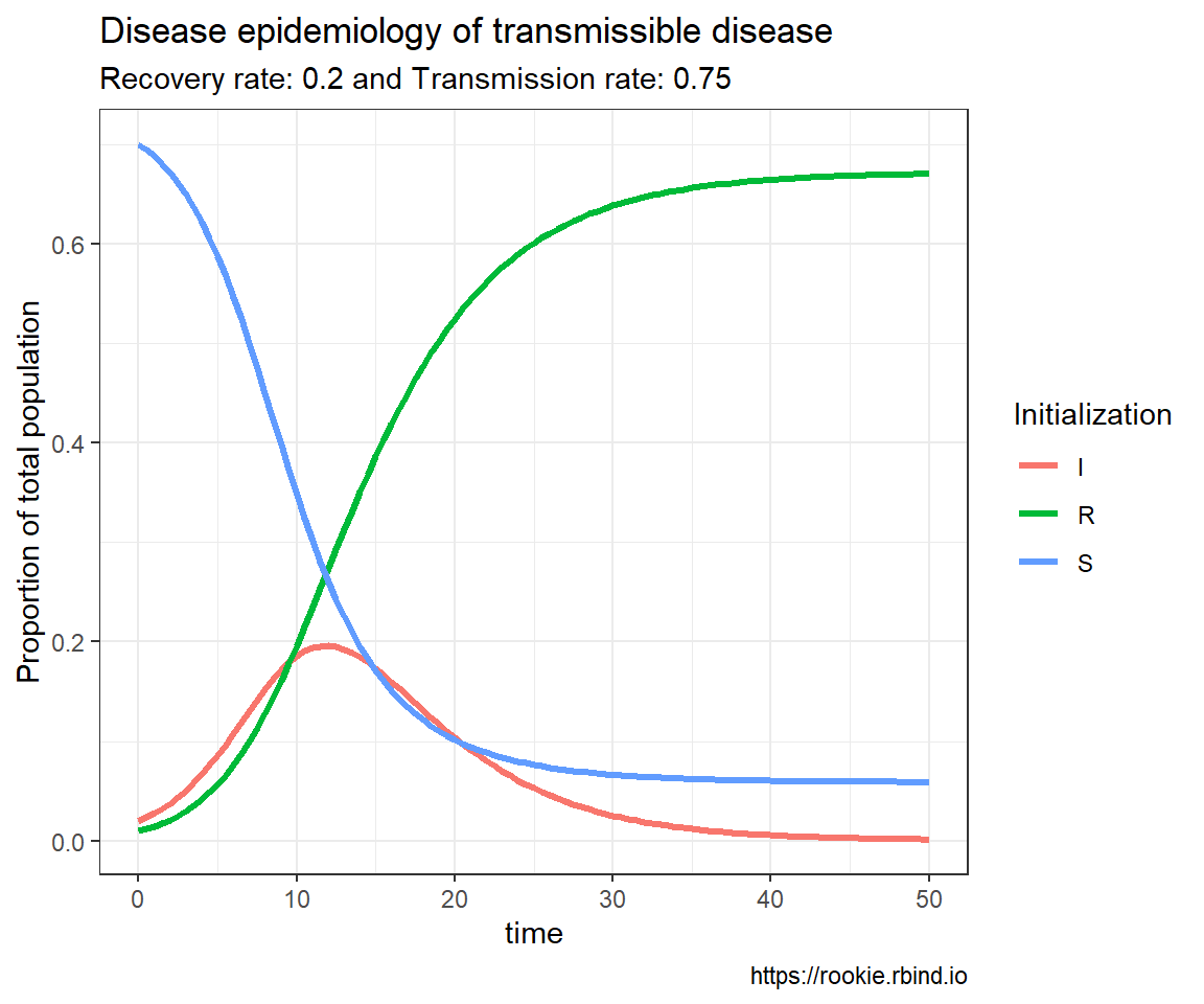
Disease epidemiology: A simulation scenario of infectious viral disease (COVID-19)

SIR model of COVID-19 epidemiology

## # A tibble: 5,555 × 6
##    beta_id  time       S      I      R beta_value
##    <chr>   <dbl>   <dbl>  <dbl>  <dbl>      <dbl>
##  1 1         0   0.7     0.02   0.01          3.2
##  2 1         0.5 0.662   0.0541 0.0134        3.2
##  3 1         1   0.575   0.133  0.0223        3.2
##  4 1         1.5 0.420   0.268  0.0420        3.2
##  5 1         2   0.242   0.411  0.0763        3.2
##  6 1         2.5 0.117   0.491  0.122         3.2
##  7 1         3   0.0521  0.506  0.172         3.2
##  8 1         3.5 0.0235  0.484  0.222         3.2
##  9 1         4   0.0111  0.450  0.269         3.2
## 10 1         4.5 0.00559 0.413  0.312         3.2
## # ℹ 5,545 more rows

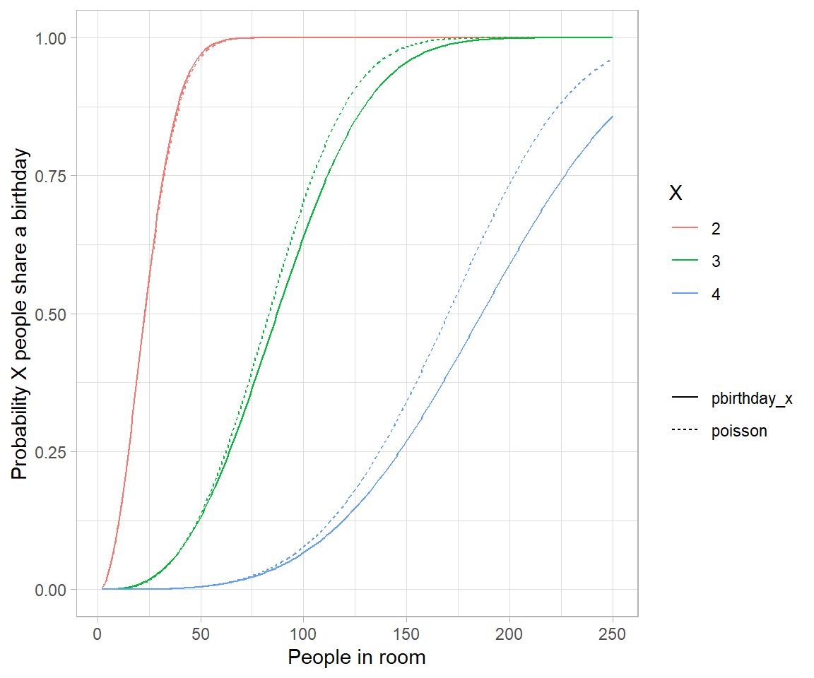
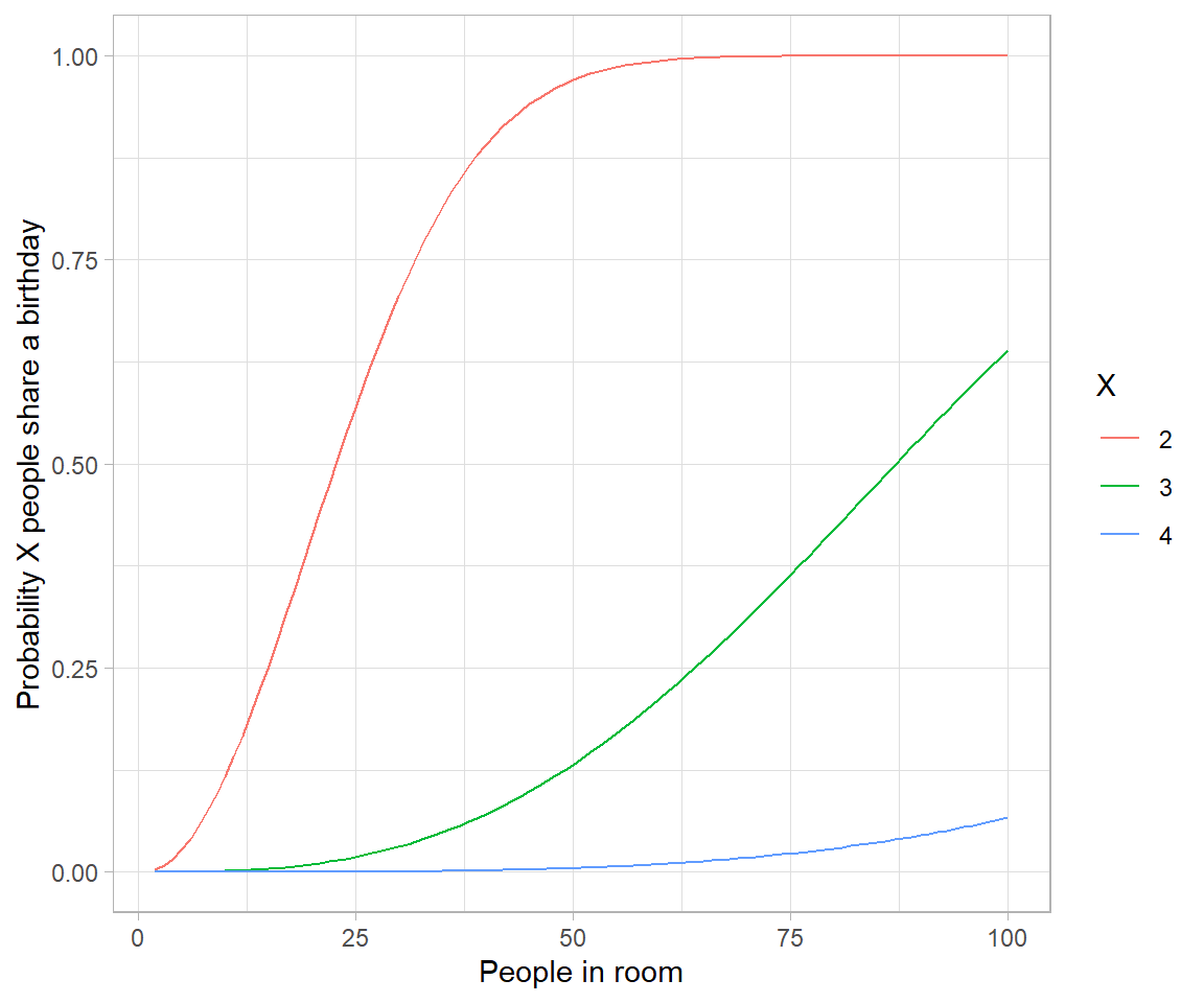
The birthday problem: Non analytical solution

# Birthday problem

crossing(n = 2:100, 
         x = 2:4) %>% 
  mutate(probability = map2_dbl(n, x, ~pbirthday(.x, coincident = .y))) %>% 
  ggplot(aes(n, probability, color = factor(x))) +
  geom_line() +
  labs(x = "People in room", 
       y = "Probability X people share a birthday", 
       color = "X")
# Approximating birthday paradox with Poisson distribution

crossing(n = 2:250, 
         x = 2:4) %>% 
  mutate(combinations = choose(n, x), 
         probability_each = (1/365)^(x-1), 
         poisson = 1-dpois(0, combinations * probability_each), 
         pbirthday_x = map2_dbl(n, x, ~pbirthday(.x, coincident = .y))) %>% 
  gather(type, probability, pbirthday_x, poisson) %>% 
  ggplot(aes(n, probability, color = factor(x), lty = type)) +
  geom_line() +
  labs(x = "People in room", 
       y = "Probability X people share a birthday", 
       color = "X", 
       lty = "")
# the reason is because events are no longer weakly dependent-every pair makes triplets
# more likely.

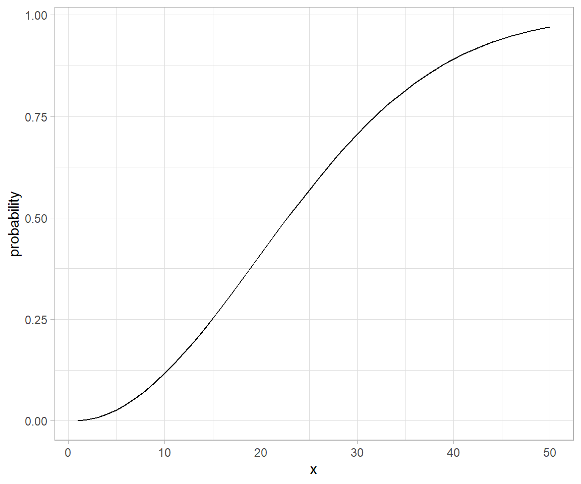
# Analytical solution to birthday problem (Mikhail Papov; bearlogic.github.io)

# Suppose, we are interested in the probability that, in a set of n randomly chosen people, some pair of them will have the same
# birthday (which we refer to as event A).

# Using Kolmogorov axionms and conditional probability, we can derive an analytical solution for P(A):

# P(A) = 1-\frac{n!.\binom{365}{n}}{365^n}

# This can be solved in `R` as:

pa <- function(n){
  1 - (factorial(n) * choose(365, n))/(365^n)
}

map_dfr(.x = list(probability = 1:50), .f = pa) %>% 
  mutate(x = seq_along(probability)) %>% 
  ggplot(aes(x = x, y = probability)) +
  geom_line()

Tidytuesday: Claremont Run, X-men Characters

X men characters

Data dictionary explore

Table: Table 1: Data summary

Name Piped data
Number of rows 308
Number of columns 9
_______________________
Column type frequency:
character 8
numeric 1
________________________
Group variables None

Variable type: character

Making Summary Tables in R

Background

Table output of R is one of the richest and satisfying to use feature. Rmarkdown format provides loads of package support to create, format, and present tables beautifully. This is on one aspect extremely useful while on the other end it could very well be daunting as to choose between various package options to use while formating your table. I have a bunch of suggestions and enlistments here to help get off that dilemma.

Time Series: Basic Analysis

Background

This post is the first in a series of upcoming blog that tries to describe application of a lesser used technique in econometrics – time series analysis. I make extensive use of datasets available in several R packages – mostly the tsibbledata package. Furthermore, an external package hosted in github.com/FinYang/tsdl repo will be used.

Color charts: An introductory review on applications to qualitative crop phenotyping

Background

Colorimetry is a fascinating topic to discuss. In conjunction with the patterns of a natural world (See this awesome video about fibonacci numbers and plants), colors could have mesmerizing feels. In this post and the follow-up article, we will discuss in details about colorimetric features of a universe made of plants, in particular, which are cultivated/adopted and have edible human values – the agricultural crops. Then again, there are quite a large number of agricultural species to deal with. So, we will be making a touch down on some common crop species, i.e. Pea (Pisum sativum, wild counterpart of the famous Lathyrus pea studied by Mendel) and Wheat (Triticum aestivum).

String tip: vectorized pattern replacement

Example case

Suppose you have a bunch of really filthy names, which makes you puke… You can go about fixing those with the help of stringi and stringr

Lets say following character vector hosts those filthy names.

filthy <- c("Grains %", "Moisture (gm/kg)", "Plant height (cm)", "White   spaces", "White space  (filth%)")
filthy
## [1] "Grains %"              "Moisture (gm/kg)"      "Plant height (cm)"    
## [4] "White   spaces"        "White space  (filth%)"

Now to get rid of the filth use string manipulation.

String tip: complex pattern recognition

Background

This post is all about examples and use cases. So…Let’s break a leg.

  1. Extract all words except last one using anchors and look arounds
nasty_char <- c("I love playing wildly") # remove the last word "wildly"

stringr::str_extract(nasty_char, ".*(?=\\s[:alpha:]*$)")
## [1] "I love playing"

Variance component based parameter estimation of incomplete block designs

Introduction

Variance component models are also suited for analysis of incomplete block designs, besides complete block designs. This post aims to demonstrate exactly that. Using a dataset generated from alpha lattice design, I show how the design can be properly modeled and fit using OLS regression having various fixed model components. This system of model fitting is analogous to classical ANOVA based technique of estimating parameters.

Linear mixed model formulation

Introduction

Mixed models are quite tricky, in that, while being very powerful extensions of linear models, they are somewhat difficult to conceptualize and otherwise to specify. Mixed models have, in addition to usual fixed effect combination of factors, random effects structure. These structure need to be specified in the model formula in R. While formula specification of a model is unique in it’s own respect, the formuala expression too leads to an object with differnt properties than a regular R object. Although, the complexity of formula syntax can arbitrary (constrained by classess and methods working on that), a general guideline is applicable for most of the mixed modeling utilities. These include: lme4, nlme, glmmADMB and glmmTMB.

Design and analysis of spit plot experiments

Split plot design

Design and fieldbook template

In a field experiment to test for effects of fungicide on crop, treatment of fungicides may be distinguised into multiple factors – based on chemical constituent, based on formulation, based on the mode of spray, etc. In a general case scenario where two former factors could be controlled, factor combinations may be organized in several different ways. When fully crossed implementation is not possible, split plot design comes to the rescue.

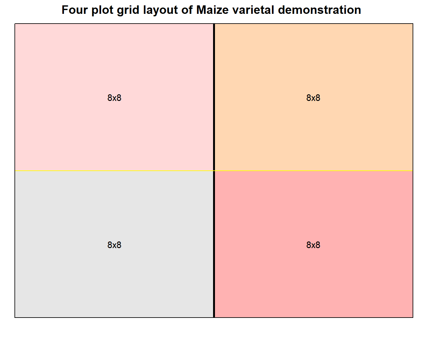
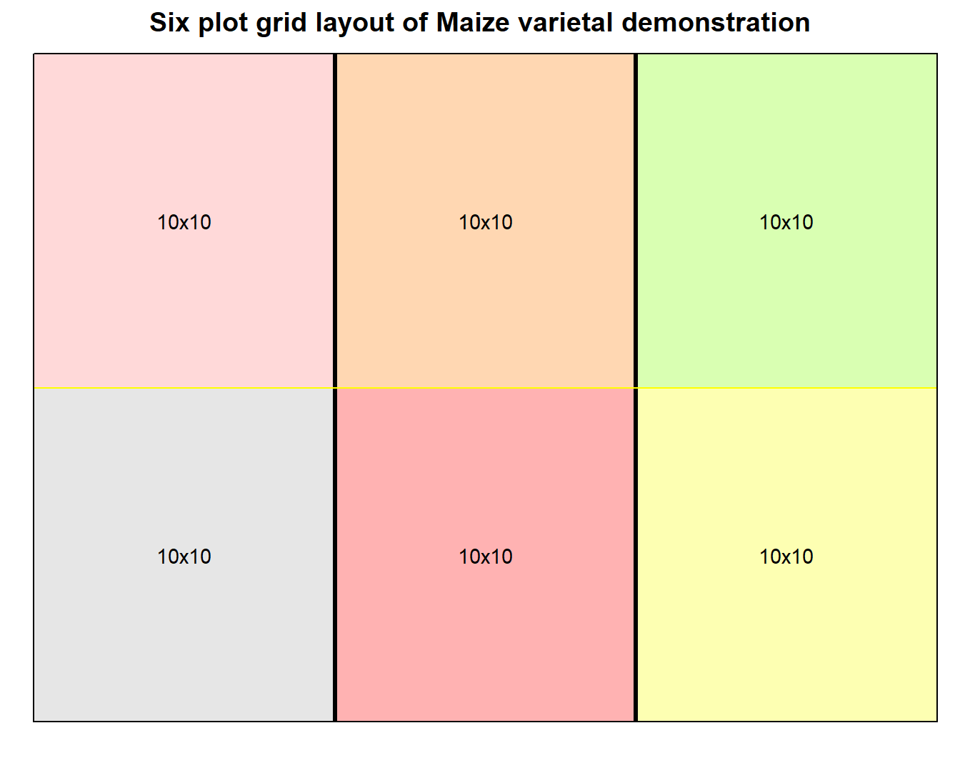
Layout and visualization of experimental design

Functional approach to creating and combing multiple plots

This approach highlights features of gridExtra package that allows combining multiple grob plots using function calls. We explicitly use lapply/split or similar class of purrr functions to really scale the graphics.

We load a Hybrid maize trial dataset, with fieldbook generated using agricolae::design.rcbd(). The dataset looks as shown in Table 1, after type conversion and cleaning.

(\#tab:rcbd-maize-fieldbook)Intermediate maturing hybrids with 50 entries each in 3 replicated blocks
Rep Block Plot Entry col row tillering moisture1 moisture2 Ear count Plant height
1 1 1 1 1 1 3.0 3.5 35 270
1 1 2 3 1 2 3.0 3.5 25 266
1 1 3 18 1 3 3.5 4.0 30 261
1 1 4 32 1 4 4.0 4.5 26 224
1 1 5 37 1 5 4.0 4.5 30 268
1 2 6 27 1 6 4.0 4.5 20 268
1 2 7 21 1 7 4.0 4.5 25 277
1 2 8 13 1 8 3.5 4.0 25 264

For the given dataset, we can draw on the information that Rep variable was used as field level blocking factor (Although separate, Block, variable exists, it was nested inside the Rep.) Therefore, to begin with, we ignore other spatial grouping variable. Now, since the grid graphics only requires two way represenation of plotting data, we have row and col information feeding for that.

Expressing timestamp data in calendar

Unlike composing a text memos and keeping tracks of those, calendar graphics is a highly effective visual aid to taking notes and summarizing them. Well, we all have used calendar, one way or the other, in our lifetimes.

Calendar based graphics enables an accurate catch at the very first glance; For example, it is very easy relating one activity of a period to another when they are laid linearly with precise graduations. Calendar graphics does exactly that – some features (usually tiles) provide graduation, representing fixed interval of time (e.g., a day). This when combined with text allows unlimited freedom to provide narration for specific intervals.

Developing flowcharts: an illustration of wheat breeding scheme

Flow diagrams are jam-packed with information. They normally describe a process and actors that are involved in making that happen.

With r package diagram, which uses r’s basic plotting capabilities, constructing flowcharts is as easy as drawing any other graphics.

This post expands on creating simple flowdiagrams using example scenario of a wheat breeding program. The information for this graph was, most notably, deduced from those provided by senior wheat breeder of Nepal, Mr. Madan Raj Bhatta.

Grade X result


Total Marks and Final Grades {-}

roll number English Total Marks Nepali Total Marks C. Maths Total Marks Science Total Marks Extension Total Marks Soil Total Marks Plant protection Total Marks Fruit Total Marks Agronomy Total Marks Computer Total Marks O. Maths Total Marks English Total Marks Agg grade Nepali Total Marks Agg grade C. Maths Total Marks Agg grade Science Total Marks Agg grade Extension Total Marks Agg grade Soil Total Marks Agg grade Plant protection Total Marks Agg grade Fruit Total Marks Agg grade Agronomy Total Marks Agg grade Computer Total Marks Agg grade O. Maths Total Marks Agg grade
1 70.2 57.2 NA 72.4 77.3 84.9 81.9 74.8 88.2 88.3 NA B+ C+ NA B+ B+ A A B+ A A NA
2 76.8 46.2 NA 63.2 72.1 82 77 71.7 81.2 74.7 NA B+ C NA B B+ A B+ B+ A B+ NA
3 82.8 57 NA 56 89.8 82.5 82.1 85.3 89.7 79 NA A C+ NA C+ A A A A A B+ NA
4 42.4 19.5 NA 20.6 48.8 58.2 50.1 49.8 54.8 67 NA C E NA D C C+ C+ C C+ B NA
5 55.2 34.3 NA 33.2 49.6 64.2 59.8 57.1 61 73.3 NA C+ D NA D C B C+ C+ B B+ NA
6 49.5 43.3 NA 24.8 51.7 55.5 52.9 46.4 55.4 65.5 NA C C NA D C+ C+ C+ C C+ B NA
7 71.4 50.4 NA 54.8 75.7 71.6 76.8 61.7 80.6 77.2 NA B+ C+ NA C+ B+ B+ B+ B A B+ NA
8 73.8 45.3 NA 62 83.9 81.7 78.1 83.6 88.2 79.4 NA B+ C NA B A A B+ A A B+ NA
9 51.9 39.9 NA 26.8 56.9 56 62 49.6 57.2 64.7 NA C+ D NA D C+ C+ B C C+ B NA
10 NA NA NA NA NA NA NA NA NA NA NA NA NA NA NA NA NA NA NA NA NA NA
11 42 20.6 NA 22.1 49.2 54.2 53.8 44.5 51.2 59.3 NA C D NA D C C+ C+ C C+ C+ NA
12 52.6 22 NA 36.9 57.9 69.6 67.1 61.2 65.8 68.2 NA C+ D NA D C+ B B B B B NA
13 61.8 30.8 NA 27.9 59.5 65.8 63.3 53.8 62.4 70.7 NA B D NA D C+ B B C+ B B+ NA
14 58.8 32.6 NA 19 51.8 54.7 63.3 48.4 60.1 68 NA C+ D NA E C+ C+ B C B B NA
15 69.3 34.6 NA 35.1 55.3 62.3 63.5 63.8 66.2 80.6 NA B D NA D C+ B B B B A NA
16 54.9 23.9 NA 29 48.7 56.6 54.4 53.4 55.7 59.6 NA C+ D NA D C C+ C+ C+ C+ C+ NA
17 58.2 37.2 NA 25.7 66.9 66.6 66.3 62.8 70.1 64.4 NA C+ D NA D B B B B B+ B NA
18 NA NA NA NA NA NA NA NA NA NA NA NA NA NA NA NA NA NA NA NA NA NA
19 48.7 40.9 NA 27.4 77.1 72.8 70 66.5 75.2 62.6 NA C C NA D B+ B+ B+ B B+ B NA
20 48.1 26.5 NA 22.9 56.7 64.6 54 51.2 64.6 61.9 NA C D NA D C+ B C+ C+ B B NA
21 NA NA NA NA NA NA NA NA NA NA NA NA NA NA NA NA NA NA NA NA NA NA
22 70.5 42.8 NA 55 70.5 74.4 60.8 73.2 81.5 73.2 NA B+ C NA C+ B+ B+ B B+ A B+ NA
23 NA NA NA NA NA NA NA NA NA NA NA NA NA NA NA NA NA NA NA NA NA NA
24 32.5 31.2 NA 18.7 46.2 47.4 49.2 48.5 46.7 55.4 NA D D NA E C C C C C C+ NA
25 46.7 43.3 NA 29.6 55.2 59.9 59.7 55.5 60.3 61.7 NA C C NA D C+ C+ C+ C+ B B NA
26 58.5 51.6 NA 36.6 75.3 70.6 75.8 67.4 80.4 68.3 NA C+ C+ NA D B+ B+ B+ B A B NA
27 NA NA NA NA NA NA NA NA NA NA NA NA NA NA NA NA NA NA NA NA NA NA
28 66.3 45.9 NA 58.6 77.9 80.8 79 63 79.1 81.1 NA B C NA C+ B+ A B+ B B+ A NA
29 43.8 42.2 NA 30.7 55.9 64.4 57.5 51.9 56.1 64.1 NA C C NA D C+ B C+ C+ C+ B NA
30 55.2 41.2 NA 29 55.8 68 61.8 57.6 65.5 64.3 NA C+ C NA D C+ B B C+ B B NA
31 67.8 51.8 NA 51.8 80.3 74.9 79.3 73.4 82.6 72.1 NA B C+ NA C+ A B+ B+ B+ A B+ NA
32 61.8 41.4 NA 52.4 71.9 76.4 76 74.7 77 66.3 NA B C NA C+ B+ B+ B+ B+ B+ B NA
33 54.9 45.1 NA 30.5 65.2 78.9 76.8 64.2 78.1 72.8 NA C+ C NA D B B+ B+ B B+ B+ NA
34 52 37.6 NA 25.9 51.4 60.2 60.6 55.5 60.5 61.8 NA C+ D NA D C+ B B C+ B B NA
35 NA NA NA NA NA NA NA NA NA NA NA NA NA NA NA NA NA NA NA NA NA NA
36 54.6 40.9 NA 32.3 51.8 62.6 58.9 58.5 55.2 65.7 NA C+ C NA D C+ B C+ C+ C+ B NA
37 18.9 14.7 NA 17.4 5.7 24 18 18 10.1 25.7 NA E E NA E E D E E E D NA
38 61.5 42.7 NA 59.4 80.8 83.2 72.8 74.4 84 70.8 NA B C NA C+ A A B+ B+ A B+ NA
39 74.4 40.2 NA 49.8 62.1 60.9 60.9 59.1 66.6 77.1 NA B+ C NA C B B B C+ B B+ NA

NA indicates the absence of student

Tidyverse and tidbits

Ideas surrounding tidy evaluation

  1. R code is a tree

    Every expression in R can be broken down to a form represented by a tree. For instance, on top of the tree there is “a function call” followed by it’s branches: first child = function name itself, other children = function arguments. Complex calls have multiple levels of branching.

  2. The code tree could be captured by quoting

    expr() quotes your(function developer) expression

Memorize the date? Don’t need to, use lubridate

My sufferance

Time and again, I’ve suffered due to my humanistic limitations of memorizing things promptly. I suck at remembering stuffs, dates particularly. So, In this blog trip (Oh! this is a trip btw, because I don’t forsee myself surpassing my memory limitations any sooner than death), I will be stating if not rambing on some lifesaving tricks of picking up pieces of your faulty brain.

The balm

I’m getting into the details of using base R’s date() and date related functions. At this time, It’s might seem relevent to have some understanding of “POSIXlt” and “POSIXct” object classes. But most often these never interfere unless you have a good – not expecting perfect – conscience of how you recorded your dates and what you eventually intent to achieve from it. Anyway, for a quick reference, here I’ve quoted the R’s documentation on ?DateTimeClasses:

Stability analysis: how to guide

Meaning of stability

Comparison of treatments may also imply cross comparison of their stability across multiple environments, especially when a study constitutes a series of trials that are each conducted at different locations and/or at different periods in time (henceforth referred to as MET; Multi-Environment Trial). Several situations exist where only mean based performance analysis are regarded inconclusive.

For example, in varietal release process the authorizing body seeks record of consistent trait performace of certain crop genotype. The imperative is: a variety needs to be stably exhibit it’s characters in the proposed domain of cultivation, which generally is a wide area, throughout a long duration of cultivation cycles. This pre-condition of stable character inheritance is more relevant to crops constituting a homogenous and homozygous population. Either of the location, time period or combination of both, more commonly framed as year in field researches, could be assumed to present an unique environment that treatment entries are tested in. Thus, for results to be widely applicable, performance measures across environments should be more or less stable. To the contrary, the concept of utilizing differential character expression across different environments is often explored when interaction between genotypes and environments result in more desirable character.

Resource optimization

library(lpSolve)
library(tidyverse)

Issue

A farmer has 600 katthas of land under his authority. Each of his katthas of land will either be sown with Rice or with Maize during the current season. Each kattha planted with Maize will yield Rs 1000, requires 2 workers and 20 kg of fertilizer. Each kattha planted with Rice will yield Rs 2000, requires 4 workers and 25 kg of fertilizers. There are currently 1200 workers and 11000 kg of fertilizer available.

Dealing with factors

A factor is an headache

I have a dataset, cleaning which has been a pain lately. I’m going to use 20 observations of the imported dataset in this post to demonstrate how pathetically have I been advancing with it.

plot jan_23_2017 jan_26_2017 jan_29_2017 feb_02_2017
1 0 0 b am
2 f s 1p 10p
3 b a sm 3p
4 b b ap 2
5 0 b bp s
6 b a sp 3

Providing it a context, the columns represent multiple observations of same variable at different dates, as apparent from the column names.

An encounter with blogdown

An encounter with web content related to R, although for me it is usually random, is in general welcoming. The link to this amazing feature building on the fact that using a markdown language is rather a pleasant way to write a blog post in a fully costumizable website all by yourself is enticing, to me at least. I started weaving thoughts right at the moment.