Relating quantile distribution and selection intensity
By Deependra Dhakal in R
November 7, 2020
What has wikipedia to say about ?
In probability and statistics, the quantile function, associated with a probability distribution of a random variable, specifies the value of the random variable such that the probability of the variable being less than or equal to that value equals the given probability. It is also called the percent-point function or inverse cumulative distribution function.
For example, the cumulative distribution function of exponential ($\lambda$) (i.e. intensity \(\lambda\) and expected value (mean) \(\frac{1}{\lambda}\)) is:
$$ F(x;\lambda) = \begin{cases} 1-e^{-\lambda x} & x \ge 0, \ 0 & x < 0. \end{cases} $$
The quantile function for exponential ($\lambda$) is derived by finding the value of \(Q\) for which \(1 - \exp^{-\lambda Q} = p\):
$$ Q(p;\lambda )={\frac {-\ln(1-p)}{\lambda }} $$
Plotting quantile function using ggplot2
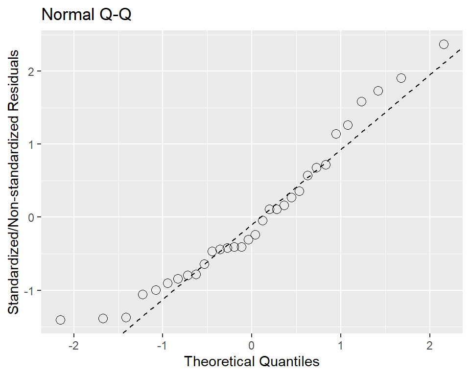
The standard Q-Q diagnostic for linear models plots quantiles of the standardized residuals vs. theoretical quantiles of N(0,1). By default, the ggplot doesn’t seem to contain code for calculating the parameters of the qquline, so,
res_vector <- residuals(lm(data = mtcars, mpg ~ cyl + disp + hp))
res_vector <- rstandard(lm(data = mtcars, mpg ~ cyl + disp + hp))
# the res_vec may/not be standardized residuals

res_vector_q <- quantile(res_vector[!is.na(res_vector)], c(0.25, 0.75)) # theoretical quantiles from given residuals
res_vector_qnorm <- qnorm(c(0.25, 0.75))
slope <- diff(res_vector_q)/diff(res_vector_qnorm) # slope
intercept <- res_vector_q[1L] - slope * res_vector_qnorm[1L] # intercept

d <- enframe(res_vector, value = "residual")

ggplot(d, aes(sample = residual)) +
  stat_qq(shape=1, size=3) +
  labs(title="Normal Q-Q", # plot title
       x="Theoretical Quantiles", # x-axis label
       y="Standardized/Non-standardized Residuals") + # residuals standardized/or not
  geom_abline(slope = slope, intercept = intercept, linetype = "dashed")

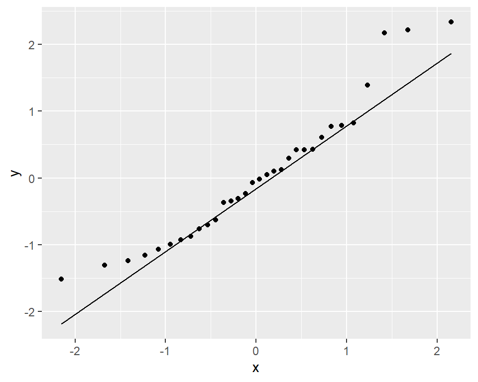
# or, with latest ggplot2, new function stat_qq_line is implemented.
model <- lm(mpg ~ wt, data = mtcars)
ggplot(model, aes(sample = rstandard(model))) + geom_qq() + stat_qq_line()

Selection intensity
The goal of this post is to demonstrate computing selection intensity and corrected selection intensity for finite population size. likewise, I try to explain a bit about quantile function, and about what it is used for in selection procedures. Furthermore, it is graphically demonstrated.
Suppose we have a finite population of 100 individual (plants) for selection. Now we select top 10% of the individuals among them to progress into next generation. So,
# http://www.ihh.kvl.dk/htm/kc/popgen/genetics/8/1.htm
# http://agtr.ilri.cgiar.org/Documents/compendia/Comp%20Selection%20Appendix.pdf
# https://jvanderw.une.edu.au/Day1cChangeofVariance.pdf
# https://wiki.groenkennisnet.nl/display/TAB/Chapter+9.5%3A+Selected+proportion+and+selection+intensity

selection.proportion <- 0.10
threshold <- -qnorm(selection.proportion)
height.at.threshold <- exp(-0.5 * (threshold ^ 2)) / sqrt(2 * pi)
# infinite pop size
selection.intensity <- height.at.threshold / selection.proportion
# corrected for finite pop size
# let us suppose population size
pop.size <- 10000
selection.intensity.corr <- selection.intensity - (pop.size - (pop.size * selection.proportion)) / (2 * selection.proportion * pop.size * ((pop.size + 1) * selection.intensity))
-qnorm(0.1)
## [1] 1.281552